
Light & Materials / GUIDE 18
Apartment Interior Design Abu Dhabi: Warm Neutral Colour Palettes
Develop a warm neutral palette for an Abu Dhabi apartment using real samples, balanced undertones, varied textures and the room's existing finishes.
The essential idea
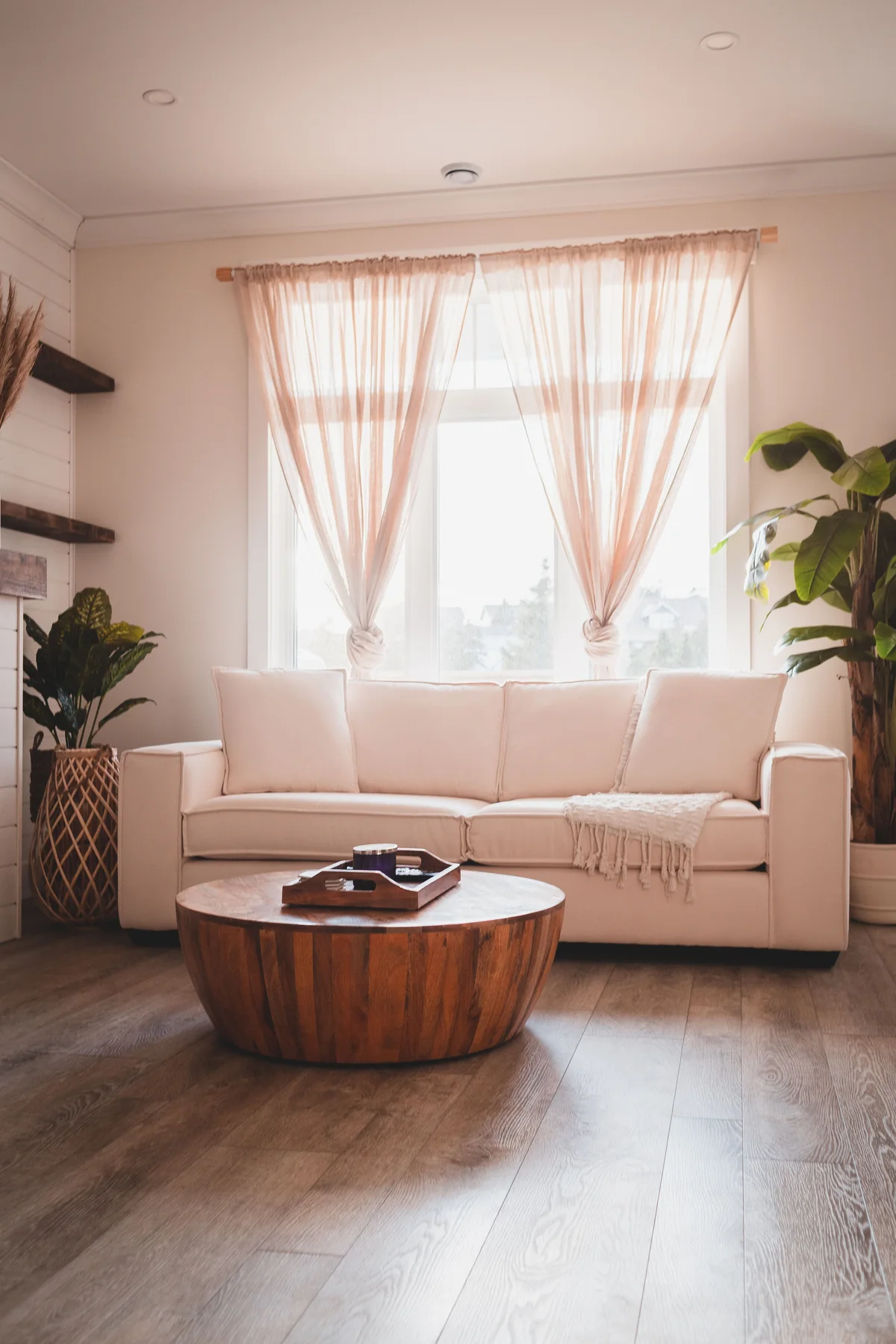
A warm neutral palette depends on relationships between undertones, texture and light. Start with fixed finishes, choose a small group of compatible colours, and compare physical samples in the apartment. Add depth through contrast and material character rather than filling the room with nearly matching beige shades.
Neutral rooms can feel rich and comfortable, but they can also look flat or unexpectedly mismatched. A wall colour that seemed warm in a showroom may appear pink beside the floor or grey under evening lighting. In an Abu Dhabi apartment, the palette should be developed in the actual setting. Existing stone, timber, cabinetry and daylight are part of the colour scheme whether or not they are being replaced.
Begin with what will remain
List the fixed finishes that are staying: flooring, kitchen fronts, doors, stone surfaces and window frames. These often occupy more visual space than decorative accessories. A palette that ignores them may require increasingly complicated attempts to make the room feel coherent.
Photographs are useful records, but they are not reliable substitutes for physical samples. Keep a small sample set wherever possible and use it when comparing new materials.
Identify the dominant undertones
Look for the warmer, cooler, yellow, pink or grey tendencies within each material. The aim is not to make every item identical. It is to understand where a contrast feels deliberate and where it appears accidental.
Compare materials beside each other in the room rather than inspecting them individually. A cabinet finish can look neutral on its own and noticeably different when placed next to the intended wall colour.
Set a clear hierarchy
Choose a main background, a supporting tone and a limited amount of contrast. This makes the room easier to read and reduces the temptation to add more finishes whenever something feels unresolved. Let the largest surfaces lead.
A darker table, metal detail or framed artwork can give definition to a pale room. The amount of contrast should suit the household's preference and the apartment's proportions, rather than follow a fixed formula.
Use texture for variety
Smooth, woven, brushed and softly grained surfaces can add interest within a restrained colour range. Select textures according to their use and care requirements. A highly textured upholstery may feel inviting but need a cleaning approach the household does not want.
| Element | Contribution to the palette |
|---|---|
| Main wall finish | Establishes the background tone |
| Timber or timber-look surface | Adds grain and visual warmth |
| Upholstery | Introduces softness and everyday comfort |
| Metal detail | Creates a small point of contrast |
| Curtains | Connect the window to the room's colours |
Test samples at a useful scale
Small paint chips can be misleading. Use an appropriate larger sample and view it in more than one position. Compare it in daylight and under the lighting that will actually be used.
Do not approve colours only on a phone screen. Device settings, photography and surrounding colours all affect the impression. Keep a record of the final product references so procurement does not depend on a visual approximation.
Edit the completed composition
Once the main pieces are installed, add accessories gradually. Repeat selected tones where helpful, but allow some surfaces to remain quiet. Every shelf does not need a decorative object to justify its presence.
If the room still feels flat, look first at light, proportion and contrast before introducing another colour. A successful warm neutral apartment has enough variation to feel inhabited and enough restraint to let daily life remain the focus.
Common questions
Does a warm neutral apartment have to use beige walls?
No. Warmth can come from timber, textiles, lighting and the relationship between materials. A soft off-white or another restrained background may work well. Choose the wall colour in response to the fixed finishes and the room's actual light.
Can warm and cool neutrals be used together?
Yes, when the combination is intentional and balanced. Test physical samples together and decide which tone leads. Repeating a connecting material or colour can help the contrast feel considered rather than accidental.